Tips for Drawing Studio Ghibli-Inspired Landscapes
Have you ever wondered what makes Ghibli landscapes so enchanting? It’s their perfect mix of realism and magic. These scenes feel alive—like you could step right into them. From the soft glow of the skies to the lush, vibrant greenery, everything has a dreamlike quality. You don’t need to be a professional artist to capture this vibe. With the right techniques and a little patience, you can bring your own Ghibli-inspired worlds to life.
Key Takeaways
- Choose the right canvas size for your artwork. For digital art, use at least 3300 by 2550 pixels for prints. This ensures your work looks sharp and professional.
- Select a Ghibli-inspired color palette with soft pastels and earthy tones. These colors create a nostalgic vibe that enhances the magic of your landscapes.
- Start with a rough sketch to plan your composition. Focus on the horizon line and main elements to ensure balance in your artwork.
- Use gradients to create a soft, dreamy sky. Blend light blues, pinks, and purples to mimic the enchanting skies seen in Ghibli films.
- Incorporate highlights and shadows in your grass and trees. This adds depth and realism, making your landscape feel alive and vibrant.
Preparing to Draw Ghibli Landscapes
Choosing the Right Canvas Dimensions and Resolution
Before you start drawing, it’s important to pick the right canvas size. This ensures your artwork looks sharp and professional, whether it’s for printing or sharing online. For digital art, aim for at least 3300 by 2550 pixels if you’re creating a letter-sized print. Want to go bigger? An 18 x 24-inch poster needs around 3300 by 4200 pixels. If you’re designing for social media, a smaller size like 2000 by 1200 pixels works just fine.
If you’re working traditionally, canvas sizes vary depending on where you live. In North America, sizes are measured in inches, like 16×20 inches. In Europe, they’re measured in centimeters, such as 40×50 cm. Not sure how to convert? Just multiply inches by 2.54 to get the size in centimeters.
Here’s a quick tip: If you’re planning to hang your artwork, the width of your canvas should be about two-thirds to three-fourths the width of the furniture below it. This helps create a balanced look.
Selecting a Ghibli-Inspired Color Palette
Colors play a huge role in capturing the magic of Ghibli landscapes. Think soft pastels and earthy tones. These colors create a nostalgic, dreamlike vibe that’s perfect for your artwork. For example, use muted greens and browns for forests, and add pops of vibrant flowers to make the scene come alive.
Studio Ghibli films often use color to set the mood. A warm, golden palette can evoke a sunny afternoon, while cooler blues and purples might suggest a quiet, magical evening. Experiment with these tones to find the perfect balance for your landscape.
Sketching a Rough Composition with Key Elements
Before diving into the details, start with a rough sketch. This helps you plan the layout and ensures your composition feels balanced. Spend 10-15 minutes sketching out the main elements, like the horizon line, trees, or a winding path.
“Composition allows us to make the most of a subject. A crude drawing can be interesting with good composition. However, an otherwise masterful painting will look boring if the composition is bad.”
When sketching, think about where the horizon line will go. It divides the sky and land, so placing it too high or too low can change the entire feel of your artwork. A little planning here saves you from frustration later.
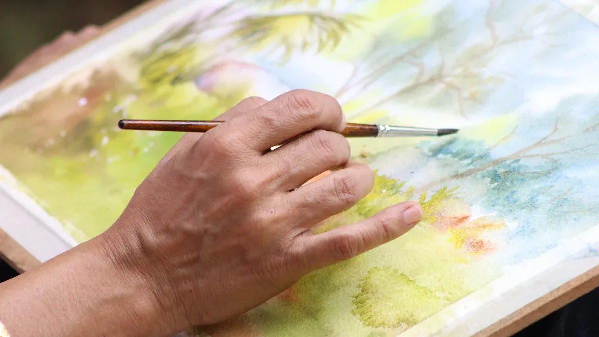
Painting the Sky and Clouds
Image Source: pexels
Creating a Soft, Dreamy Sky with Gradients
The sky is the heart of many Ghibli landscapes. To create that soft, dreamy effect, start by blending gradients. Use light blues, soft pinks, and gentle purples to mimic the magical skies seen in Studio Ghibli films. Begin with the lightest color at the horizon and gradually transition to darker shades as you move upward.
Here’s a tip: Use a large, soft brush for smooth blending. If you’re working digitally, adjust the opacity of your brush to layer colors seamlessly. For traditional art, try using a sponge or blending tool to soften edges.
Want to add a touch of fantasy? Incorporate glowing celestial objects like moons or stars. Thin white acrylic paint works wonders for creating a halo effect around these elements. Swirl it softly with a round brush to make them shine. You can also flick diluted white paint to create delicate star speckles, adding a magical touch to your sky.
Adding Fluffy Clouds with Light and Shadow
Clouds in Ghibli landscapes aren’t just background elements—they’re characters in their own right. To make them fluffy and full of life, focus on light and shadow. Start by sketching the basic shapes of your clouds. Think rounded edges and soft curves.
When painting, use a light base color like white or pale gray. Add shadows with slightly darker tones, such as soft blues or purples, to give the clouds depth. Blend the edges to keep them looking airy and natural.
For extra realism, try using tiny dotting techniques to create subtle highlights. Metallic colors like silver or pearl white can add a mysterious shimmer, making your clouds look like they belong in a dream.
Using Subtle Color Variations for Depth and Realism
A sky feels flat without color variation. To achieve depth and realism, mix a limited palette of six colors. This keeps your choices manageable while allowing for vibrant combinations.
| Color Used | Purpose/Effect |
|---|---|
| MaimeriBlu’s Neutral Tint | Achieves deep blacks in the sky |
| Indigo | Provides a rich blue tone for depth |
| Quin Magenta | Adds warmth and variation on one side |
| Cobalt Turquoise | Introduces a contrasting cool tone on the other |
Blend these colors strategically. For example, use indigo near the top of the sky to create a sense of vastness. Add warmth with quin magenta closer to the horizon. On the opposite side, cobalt turquoise can provide a refreshing contrast.
This approach not only adds realism but also encourages creative freedom. Experiment with mixing these colors to find combinations that suit your landscape.
Pro Tip: Don’t forget to step back and view your painting from a distance. This helps you spot areas where the colors might need more blending or variation.
Drawing Grass and Natural Textures
Mimicking Natural Grass with Brush Strokes
Creating realistic grass is all about mastering your brush strokes. You don’t need to paint every blade of grass—just focus on capturing the texture and movement. Art studies show that different brush techniques can mimic natural elements like grass. For example:
- Use the corner of your brush for thin, delicate strokes.
- Apply varying pressure to create a mix of thick and thin lines.
- Experiment with a dry brush to achieve a rough, textured look.
Try holding your brush at different angles. A vertical stroke can suggest tall grass, while a horizontal flick might resemble shorter, wind-swept blades. Don’t worry about perfection—grass in nature is messy and uneven. That’s what makes it beautiful!
Layering for Depth and Dimension
Grass in Ghibli landscapes often feels lush and full of life. To achieve this, layering is key. Start with a base layer of flat green tones. Once it dries, add darker shades to create shadows and lighter tones for highlights. This builds depth and makes your grass look three-dimensional.
Here are some tips to make layering easier:
- Keep your brushes clean to avoid muddy colors.
- Be patient and let each layer dry completely before adding the next.
- Practice glazing techniques to blend colors smoothly.
Don’t be afraid to experiment. Try layering different shades of green or even adding hints of yellow and brown for a more natural look. The more you practice, the more confident you’ll feel with this technique.
Adding Highlights and Shadows for Realism
Highlights and shadows bring your grass to life. Imagine where the light is coming from in your scene. Use a lighter green or even a touch of yellow to highlight areas where the sun hits. For shadows, mix a bit of blue or purple into your green to create depth.
A quick tip: Use a small, fine brush for highlights. Add tiny strokes to the tips of the grass blades to make them pop. For shadows, a soft, wide brush works best to blend darker tones into the base layer.
Pro Tip: Step back and look at your painting from a distance. This helps you see if the highlights and shadows look balanced. Adjust as needed to make your grass feel vibrant and alive.
Adding Trees, Flowers, and Whimsical Details
Image Source: pexels
Drawing Organic, Ghibli-Style Trees
Trees in Ghibli landscapes feel alive, almost like they’re characters themselves. To capture this, focus on organic shapes. Forget about perfect symmetry—real trees are full of twists and turns. Start by sketching a trunk with uneven curves. Add branches that stretch out in different directions.
When painting, use a mix of earthy browns and greens. Layer darker shades for shadows and lighter tones for highlights. This creates depth and makes the tree look three-dimensional. For leaves, try using a stippling technique. Dab your brush lightly to create clusters of foliage. You can even mix in a few unexpected colors, like soft yellows or oranges, to give your tree a whimsical touch.
Incorporating Vibrant Flowers and Small Details
Flowers bring a pop of color and charm to your landscape. Think about the types of flowers you’d find in a magical meadow—wildflowers, daisies, or even glowing blossoms. Use small, delicate strokes to paint petals. A fine-tipped brush works best for this.
Don’t stop at flowers. Add tiny details like mushrooms, pebbles, or even a hidden door in a tree trunk. These little touches make your scene feel alive. They invite the viewer to explore every corner of your artwork.
Using Overlapping Elements to Create a Lush Environment
Overlapping elements are key to creating a rich, layered look. Place trees in front of each other, with some partially hidden. Scatter flowers and grass at different heights. This technique adds depth and makes your landscape feel immersive.
Art theory supports this approach. For example:
| Concept | Description |
|---|---|
| Prospect and Refuge | Balancing open views (prospect) with sheltered areas (refuge) enhances depth and complexity. |
| Environmental Virtues | Overlapping elements suggest fertility and healthy growth, adding to the lushness of the scene. |
| Aesthetic Preference | People prefer landscapes with a mix of prospect and refuge, making overlapping elements more appealing. |
By layering and overlapping, you can create a landscape that feels vibrant and full of life. It’s a simple trick that makes a big difference.
Enhancing Light and Atmosphere
Defining a Light Source and Adding Highlights
Light is one of the most powerful tools you can use to bring your Ghibli-inspired landscape to life. Start by deciding where your light source is coming from. Is it the sun peeking through the clouds, or maybe a glowing lantern in the distance? Once you’ve chosen, everything else—shadows, highlights, and even the mood—will fall into place.
To make your lighting more effective, think about how it interacts with the objects in your scene. For example, a tree might cast a long shadow across a grassy field, while the leaves catch the sunlight and glow softly. Use highlights sparingly to emphasize areas where the light hits directly. A small touch of white or a lighter version of your base color can make these spots pop.
Here’s a quick breakdown of how a clear light source can transform your artwork:
| Effect of Light Source | Description |
|---|---|
| Shadows and Depth | Shadows define depth and structure, making your scene feel more realistic. |
| Soft Edged Shadows | A clear light source creates natural, soft-edged shadows. |
| Emotional Tone | The type of light sets the mood, making your landscape feel warm or serene. |
| Depth and Structure | Lighting establishes spatial relationships, enhancing the composition. |
| Realism | Atmospheric lighting mimics real-world effects, improving perspective. |
Tip: Always test your light source by sketching a quick thumbnail. This helps you see how the light interacts with your scene before committing to the full painting.
Using Atmospheric Perspective for Depth
Atmospheric perspective is a simple yet effective way to add depth to your Ghibli landscapes. It’s all about how objects appear lighter and less detailed as they recede into the distance. This technique mimics how the atmosphere scatters light, creating a sense of space and realism.
To achieve this effect, start by using softer, cooler colors for distant elements like mountains or trees. Gradually increase the contrast and saturation as you move closer to the foreground. For example, a distant hill might be a pale blue-gray, while the grass in the foreground bursts with vibrant greens and yellows.
Here’s how you can apply atmospheric perspective step by step:
- Step 1: Paint the background with muted tones and minimal detail.
- Step 2: Add midground elements with slightly more contrast and texture.
- Step 3: Focus on the foreground, using bold colors and sharp details to draw the viewer’s eye.
Pro Tip: Use a soft brush to blend the edges of distant objects into the sky. This creates a hazy effect that enhances the sense of depth.
Applying Effects Like Gaussian Blur for Softness
Sometimes, adding a touch of softness can make your landscape feel more magical. Gaussian blur is a fantastic tool for this. It creates a dreamy, out-of-focus effect that works beautifully for backgrounds or areas you want to de-emphasize.
If you’re working digitally, apply Gaussian blur to parts of your scene like distant trees or clouds. This helps them fade gently into the background, making your foreground elements stand out. Be careful not to overdo it, though. Too much blur can make your artwork look artificial.
Here are some technical insights about Gaussian blur:
- It involves multiple texture lookups, with about 9.6 lookups per pixel in the original image.
- The performance cost is minimal, taking only 1 to 1.5 milliseconds at a resolution of 1024x768.
- Adjusting the blur radius can prevent focused objects from bleeding into unfocused areas.
Note: If you’re painting traditionally, you can achieve a similar effect by lightly smudging edges with your finger or a blending tool. This softens transitions and adds a touch of atmosphere.
By combining these techniques—defining a light source, using atmospheric perspective, and applying Gaussian blur—you can create a landscape that feels alive and full of depth. These small details make all the difference in capturing the magic of Ghibli landscapes.
Optional: Adding Characters or Animals
Placing Characters to Enhance the Story
Adding characters to your landscape can transform it from a beautiful scene into a story waiting to be told. Where you place your characters matters a lot. It’s not just about filling space—it’s about guiding the viewer’s eye and creating a narrative.
For example, placing a character in the center of your composition naturally draws attention to them. This technique works well if the character is the protagonist of your story. Surrounding elements, like trees or paths, can then lead the viewer’s gaze toward other parts of the scene, creating a sense of progression. Research on visual storytelling shows that positioning characters strategically can highlight key story elements, such as the beginning, middle, or end of a narrative. By doing this, you can subtly guide the viewer through your artwork’s story.
Want to add more depth? Try placing secondary characters or objects in the background. This creates layers in your composition and makes the scene feel alive. Think of it as setting the stage for your story.
Drawing Animals or Creatures in the Ghibli Style
Studio Ghibli’s animals and creatures are iconic. They’re whimsical, expressive, and often carry a sense of wonder. To draw them, focus on simplicity and personality. Ghibli animals aren’t hyper-realistic—they’re stylized to fit the magical worlds they inhabit.
Start with basic shapes. For example, a cat might begin as an oval for the body and circles for the head and paws. Add details like big, expressive eyes or unique markings to give the animal character. Keep the lines soft and fluid to match the organic feel of Ghibli’s style.
Here’s a quick comparison of techniques used in Ghibli-style creatures and other animation styles:
| Title | Focus |
|---|---|
| A comparative study of Chinese and Japanese eco-aesthetics and Narrative art in animation: Legend of hei and Ghibli animation. | Examines animation techniques in the context of ecological themes in Studio Ghibli's style. |
This table highlights how Ghibli’s approach to animals often ties into the natural and magical themes of their stories. By keeping your designs simple yet expressive, you can capture that same charm.
Ensuring Characters Blend Seamlessly with the Landscape
One of the secrets to Ghibli’s magic is how seamlessly the characters fit into their environments. To achieve this, pay attention to lighting, color, and texture. Use the same color palette for your characters and the background. This ensures they don’t feel out of place.
Professor Carlo Pedretti writes, “The landscape in the painting, as in the Louvre ‘St. Anne’, is more in keeping with Leonardo’s scientific views of 1508 or later.” This highlights how integrating characters into the landscape can create a cohesive and harmonious composition.
Another tip is to match the level of detail. If your background is highly detailed, your characters should have similar intricacy. On the other hand, if your landscape is soft and dreamy, keep your characters simple and stylized. Gainsborough’s innovative methods of blending elements in his landscapes can inspire you to experiment with textures and layers to create a unified scene.
By focusing on these techniques, you can ensure your characters feel like they truly belong in the magical world you’ve created.
Drawing Ghibli landscapes is more than just creating art—it’s about crafting a world that feels alive and magical. By blending realism with whimsy, you can evoke emotions that resonate deeply with viewers. This unique combination has contributed to the global popularity of anime, with demand rising by 118% in the past two years. Studio Ghibli’s enchanting aesthetic inspires countless artists, including those exploring AI-generated art. So, grab your tools, experiment with light and color, and let your imagination guide you. The joy of creating your own magical environment is unmatched.
FAQ
What tools do I need to start drawing Ghibli-inspired landscapes?
You can use traditional tools like pencils, watercolors, and brushes or go digital with software like Procreate or Photoshop. Choose what feels comfortable for you. If you're new to digital art, start with a basic drawing tablet.
Tip: Experiment with both mediums to find your favorite!
How do I choose the right colors for my landscape?
Stick to soft pastels, earthy greens, and vibrant pops of color for flowers or details. Use warm tones for sunny scenes and cool tones for magical, evening vibes. A limited palette helps keep your artwork cohesive.
Pro Tip: Look at Ghibli movie stills for inspiration!
What’s the best way to practice drawing natural textures?
Focus on one texture at a time, like grass or bark. Use reference photos and try different brush techniques. For example, short, quick strokes work well for grass, while stippling creates realistic foliage.
- Digital Tip: Use texture brushes for added realism.
- Traditional Tip: Experiment with sponges or dry brushes.
How can I make my landscapes feel more magical?
Add whimsical details like glowing flowers, floating lanterns, or hidden creatures. Play with lighting by adding soft highlights or a glowing light source. Subtle effects like mist or sparkles can also enhance the magical vibe.
Note: Less is more—don’t overdo it!
Do I need to include characters in my landscape?
Not at all! Characters can add a story, but a well-composed landscape can stand on its own. If you do include characters, make sure they blend with the environment by matching colors and lighting.
Fun Idea: Add a tiny animal or creature for a playful touch.